The Feature-Count Trap: More Buttons Do Not Mean More Use
The feature-count trap makes extra buttons look like better value. Learn to spot useful capabilities, avoid needless complexity, and choose for the task.
The feature-count trap starts at the display shelf: a product with a crowded control panel can look more capable than a simpler one, even when you need only one job done well. The cost is not just unused buttons; it can be extra setup, more chances to choose the wrong mode, and a product that feels harder to live with.
Which task should the features serve?
Start with the moment you want the product to handle. A kettle might need to boil water for tea; a desk lamp might need to light a work surface; a food processor might need to chop vegetables. Those tasks are more useful comparison points than the number of modes printed on a box.
Write the task in ordinary language before comparing models. “Make a cup of tea without fuss” is more revealing than “find a kettle with advanced settings.” A feature earns attention if it changes the result, the effort, or the fit for the people who will use it.
Keep the task narrow enough to picture. If the product is for a shared kitchen, consider whether several people will use it, what they typically prepare, and where it will sit. If it is for one person’s desk, think about the actual work and the available space, not a hypothetical future setup.
What makes a capability useful?
A useful capability has a clear connection to a real need. A lamp’s dimmer can matter if the same desk is used for close work and relaxed reading. A timer on a rice cooker may be helpful if it fits the owner’s routine and the manufacturer’s instructions. The point is not that these features are universally valuable; it is that their purpose can be stated plainly.
Ask three questions as you inspect a feature:
- What does it change? Look for a difference in the task’s result, timing, handling, or accessibility.
- Who will use it? A capability for one household member may be irrelevant to everyone else.
- How often will the need arise? An occasional requirement can still matter, but it should be considered as occasional rather than treated like a daily benefit.
Then check whether a simpler product already handles that need. A separate timer on a phone, for instance, might serve someone as well as a built-in timer, while another person may prefer one appliance control. The comparison is about the whole routine, not about declaring one approach superior.
When does an extra control become clutter?
Every control asks for attention. A button may need a label, a menu choice, a setting to remember, or a reset after use. On a product used by several people, an obscure control can also make it harder to tell what the next person changed.
That does not make extra controls bad by definition. A control is more likely to feel like clutter when its label is vague, its function overlaps with another, or it is placed where it is easy to press by accident. Notice the physical design: are the buttons distinct by shape or position, can you read them under ordinary room lighting, and does the product make its current setting clear?
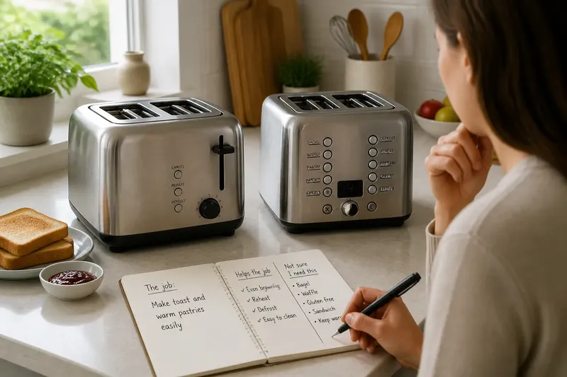
Imagine you are choosing a countertop toaster for a household that mainly makes toast and occasionally warms a pastry. One model offers a small set of clearly marked controls; another adds several unfamiliar modes. If you cannot connect those modes to foods the household actually makes, the added choices may mean more deciphering without a meaningful change to the usual breakfast.
In a shop, pause at the panel rather than scanning the feature names. Could you explain what the main controls do without opening an app or guessing? If you cannot, look for the manual or a clear product demonstration before treating the extra options as a benefit.
How can you compare features without getting dazzled?
Use a simple two-column note. In one column, name the job you expect the product to do. In the other, write the features that directly support that job and how they help. Put unrelated or unclear features in a separate “not sure I need this” note rather than counting them as advantages.
For each uncertain item, look for observable details: a control’s label, a stated compatibility requirement, an included accessory, or an instruction in the manual. A feature name alone may conceal a limitation. A “smart” function, for example, could depend on an app, a network connection, or a compatible device. Whether those conditions matter depends on how you plan to use the product.
Compare the interaction as well as the capability. A product may offer the setting you want, but make it hard to select or show whether it is active. Another may do less on paper while making its main function easy to find. Consider the number of choices you face during an ordinary use, not just the full menu shown in a product listing.
Check what is included and what is optional. A feature that relies on an accessory may not be available in the box, and a function described as compatible may require a particular model or service. Follow the product documentation and applicable instructions when those details affect use.
Which feature questions are worth asking?
Do more settings mean better results?
Not by themselves. Settings are useful when they address a need you have and make it possible to get the result you want without confusion.
Should I pay attention to a feature I might use someday?
Consider how plausible that future need is and whether the feature would be difficult to add or replace later. Treat a remote possibility as a preference, not as a reason to overlook whether the product suits your routine now.
Can a simple product be the more capable choice?
Yes, if it handles the intended task reliably for the people using it. Fewer controls can make the main function easier to identify, though simplicity is not a substitute for checking the product’s stated capabilities.
What if two people need different features?
List each person’s actual task and see whether one product supports both without making either routine awkward. If the needs conflict, compare the trade-off directly rather than assuming the longest feature list resolves it.
What should you notice after bringing it home?
During ordinary use, notice which controls you reach for and which ones you must look up. If a setting is useful, you should be able to name the occasion when it helps. If you keep forgetting what a button does, that is practical information about the design, not a personal failing.
For a shared product, see whether another household member can use the main function without a long explanation. Clear labels and a visible active setting may matter more than a collection of specialized modes. If the manual is needed for a less familiar function, keep it somewhere easy to find instead of assuming the feature will remain self-explanatory.
It can help to write a small note beside the product listing before you buy: the task, the features that serve it, and any unanswered questions. That note keeps a flashy control panel from quietly changing the decision criteria.
The feature-count trap is easiest to avoid when you make each capability answerable to a real task. Before choosing, name the job, connect each useful feature to a specific moment, and leave the rest as optional complexity—not automatic value.